 Help
Help


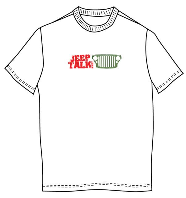
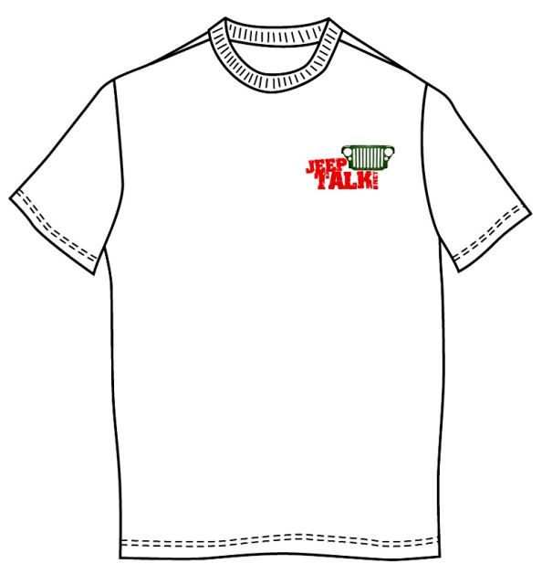
Myself and Admin have been toying with changing around a bit the JeepTalk Logo. A few have been asking for Tshirts and Stickers and the current old logo font placement is not really very good for this. We want the logo to match what will be on the shirts, stickers, etc. The only difference is that the logo on the forum will not have the web url but everything else will be the same.
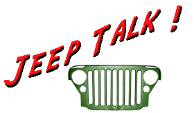
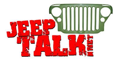
If you will notice we temporarily have changed the Original Logo. One requirements is that the Green Jeep Grill has to be there. We are using the same font and color but this can change which are cast in stone.
I've played around with a few different font colors but for some reason they don't show up as well against the light blue gradient background. Admin and myself have also looked into other skins forum combination of colors. After looking at it for a while it becomes boring and the color combination that we are using for the entire board seems to go well and pleasing to the eye with all our present graphics.
If you have something that you like to submit feel free to help out. The only requirement is that you have the Green Jeep Grill on the logo and not change the color of the grill. We also look forward to your suggestions.

I have emailed a few Members privately to get some input and there are a lot of good suggestions. I see though that communicating back and forth with all of them can get time consuming and that is why I'm creating this topic to keep it all together.
Below are the few I've recently worked with. please vote for the one you would like to see as the JT Logo, on shirts, stickers, etc.
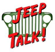
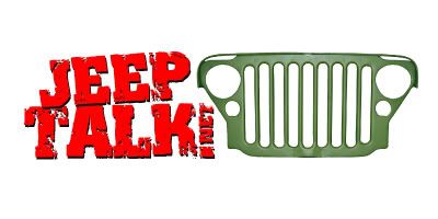
Original Logo
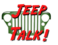
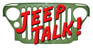
Logo 2
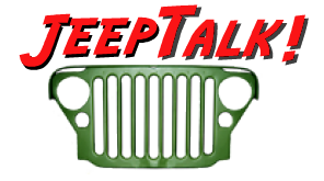
Logo 3

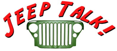
Logo 4
Logo 5
Logo 6

Logo 7 (has a bigger grill since all of the lettering is inside)
Logo 8
Logo 9


 . I for one would like to see different fonts and maybe just a hair smaller so it doesn't over take the grill. Maybe in one of the ROUND headlight (right) OR, turn signal, U might want to try
 .
.


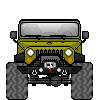


 looks like the grill has some sheen to it on the one side/top edges but I guess that is to define the edges etc. I understand your point OB1.